Interface Objects
- Pro Line
- Analog Value new!
These objects, divided into functions, pages and objects, compose the client application GUI. Please refer to the ”User Interface” section. Each object allows the user to check the system status and control the integrated elements. All these objects shares the following properties:
- Label Name of the object.
- Scale This property allows to adjust object dimensions.
- Rotation This property allows to rotate the object.
- Position This property allows to insert object coordinates in order to place it in the page.
- PIN Protection If enabled, the object is protected and to unlock actions the user must insert a PIN code. For more details refer to Configurator - Protection PINs .
- PIN Code Pin code associated to the object.
- Restrictions This property allows to define whether the object is available for a specific user profile. All objects are visible for all user accounts by default. For more details refer to Configurator - Restrictions .
- View in list If enabled, the object is displayed in the portrait view list on iPad.
- View in web If enabled, the object is displayed on the web interface.
By right clicking on a selected object, the following items are displayed in the drop-down menu:
- Add object A new system object can be selected from the list.
- Remove object The selected object will be removed from the project.
- Copy Copy the selected object.
- Paste Paste the selected object.
- Select all objects Select all the objects in the page.
- Arrange Arranges objects position. For more details refer to Configurator - Toolbar .
By right clicking on the icons of objects that can be associated with KNX groups, the following items will be active in the drop-down menu:
- Get label from ETS The selected object will be renamed according to the KNX group name previously configured in the ETS project.
- Add text from object label A ”Static text” object with the object label will be automatically added next to the current interface object icon.
Page

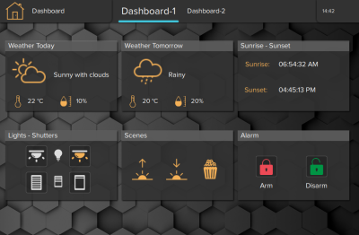
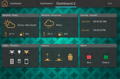
This object is the fundamental element for the User Interface. All the other customized objects forming the project are added on the page element. Each page can have a background color enabled, or a background image selected from the list available inside the software.
- Background visible Enable background option for the page.
- Background color Select the color for the background.
- Background image Enable background image.
- Background image selected Choose the background from an embedded background list.
- Background image opacity Change the opacity of the background (0=fully transparent , 100=fully opaque).
Popup

This object allows the user to create a popup instead of a page. Similar to a page, a popup can contain the majority of the User Interface objects. The popup can be designed with a different background, and can be recalled from a Generic Button or from a trigger inside the logic Module.
- Width width of the popup window.
- Height height of the popup window.
- Show Close Button When enabled, displays an X button on the top right corner to close the popup. If disabled, user will need to click outside the popup to close it.
- Background color permits to change the background color of the popup.
Open a popup from a Generic Command:
- Add the popup and design its content.
- Once finished, add a Generic Button to the desired page and access the commands window.
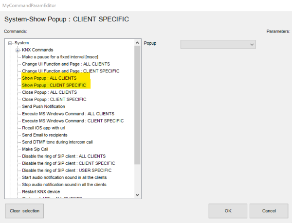
- Select the command “Show Popup: CLIENT SPECIFIC” and select the previously created popup.
Open a popup from the Logic Module:
- Add the popup and design its content.
- Go to System tab and create a new Logic Module sheet.
- Construct the logic that will trigger the popup.
- For the logic output, add the block “Command” in the Outputs category.
- Select the command “Show Popup: ALL CLIENTS” and select the previously created popup.
Picture

This object allows to import a (PNG or JPG) image file in the project. (It can be used for example as interface background).
- File Image file to select.
Static text

This object allows to insert text labels in the GUI.
- Text dimension Font dimension
- Text colour Font colour
- Multiline If enabled, if the text exceeds the maximum with, it will be displayed on more lines.
If the property ”Multiline” is set to ”Enabled”, the following properties will appear:- Max. width: Maximum width of the text field if multiline is enabled.
- Text alignment: Text alignment
Switch

This object is used for every kind of switching command: toggle, dimming, ”send 1”, ”send 0”, ”send 1 on press and 0 on release”, etc. If linked to a ”Switch schedule” object, this object can be used with a timer.
- Switching type This property indicates the way the command is sent; the following options will be displayed in the list:
- Dimmer: if this option is selected, a lighting percentage based on a value set by the user is sent to the system. (0 stands for ”turned off”, 255 stands for ”100% turned on”).
- OFF on pression: 0 is sent on pression, anything on release.
- OFF on pression, ON on release: 0 is sent on pression, 1 on release.
- ON on pression: 1 is sent on pression, anything on release.
- ON on pression, OFF on release: 1 is sent on pression, anything on release.
- ON/OFF norm. closed: 0 is sent for ON, 1 for OFF.
- ON/OFF norm. opened: 1 is sent for ON, 0 for OFF.
- Value on pression: a value predetermined by the user is sent on pression.
- Value on pression and on release: a value predetermined by the user is sent on pression and on release.
- Value on release: a value predetermined by the user is sent on release.
Bus type Six different options are displayed (KNX, Lutron, Modbus, MyHome, Philips Hue, ZWave)Graphic This property allows to select an icon which will represent the object in its different states. In addition to some standard graphics, it is possible to use a custom graphic by selecting the ”Custom” option.
If the ”Custom” option is selected, the following properties will be displayed:- File for off: Image displayed for ”Off” switch status.
- File for on: Image displayed for ”On” switch status.
- File for dimmed: Image displayed for ”Dimmed” switch status.
For every Graphic option selected it is possible to have a preview by editing the following property:
Visualisation This property allows to have a graphic preview of the object for each of its states (dimmed, on or off).
If the Switching type option is ”Value on pression”, ”Value on release” or ”Value on pression and on release”, the following properties are displayed:- Value sent to the KNX group on press (1byte).
- Value sent to the KNX group on release (1byte).
For all the kinds of switching types, a scheduling feature is available:
Time schedule If enabled, the object can be temporised using a system object.
If ”Time schedule” is ”Enabled”, the following properties will appear:- Schedule object type: Type of temporisation technique used to schedule this object.
If the selected Schedule object type is ”Calendar”, a calendar like temporisation will be adopted: - Calendar object: Calendar system object previously configured into the system.
If the selected Schedule object type is ”Chrono Switch”, a simpler temporisation will be adopted: - Time schedule object: Time schedule object previously configured into the system.
Use pop-up If enabled, this property allows the user to interact with the system using a pop-up displayed on the client application.ON/OFF group KNX group which the value is sent to.ON/OFF group feedback KNX group that allows to read the value.Value group KNX group which the value set by the user that will is sent to; if the ”Dimmer” option is selected, the light will be regulated according to this value.Value feedback group KNX group that provides the feedback of the value set by the user.Modbus gateway Modbus gateway preset in the correspondent system object properties.ON/OFF datapoint Modbus datapoint which the value is sent to.ON/OFF feedback datapoint Modbus datapoint that allows to read the value.Value set datapoint Modbus datapoint which the value set by the user that will is sent to; if the”Dimmer” option is selected, the light will be regulated according to this value.Value feedback datapoint Value feedback datapoint.Gateway Lutron Lutron gateway preset in the correspondent system object properties.Lutron output Output on the Lutron system.Hue gateway Hue gateway preset in the correspondent system object properties.Hue element Hue element, created inside Hue gateway, to control with the current object. The list of available elements depends on the switching type selected.Gateway MyHome Gateway My Home preset in the correspondent system object properties.Lights MyHome Elements preset in the system object to control with the current element.RGB Lamp

This object allows the user to control a RGB lamp from client application.
- RGB object RGB system object previously integrated into the system that will be associated to the current interface object. For more details refer to System objects - RGB.
- Supported mode Color mode used with the icon. The user can choose between “RGB” (color wheel only visible), “Tunable White” (no color wheel, just a spectrum to change the light temperature), and “RGB + Tunable White” (possibility to toggle between color wheel and temperature spectrum).
- Visualization This property allows to visualise a preview of the object for each of possible status. (ON or OFF)
- Custom images This property allows to select the icon correspondent to this object. If the ”Custom option” is selected, the ”Off image” and ”On image” properties will be displayed:
- OFF image: Image displayed for ”Off” RGB status.
- ON image: Image displayed for ”On” RGB status.
Thermo Comfort

Chronotermostat object that allows the user to set hourly, daily and weekly temperatures and boiler programs. It reads the current temperature and gives the feedback of heating and cooling valve.
- Use extended UI This property allows to select the functioning mode of the plant: if disabled, the user can either manually set the temperature using a pop-up displayed on the client application or use temporisations created using the chronotermostat. If enabled, the user can set the temperature using the predefined programs (comfort, standby, night, chrono).
- Use chronotermostat This property allows to enable or disable the usage of chronotermostat function.
The related ”Chronotermostat” system object has to be configured with the same functioning logic. ”Use extended UI” disabled → ”Temperature mode” enabled. ”Use extended UI” enabled → ”Temperature mode” disabled.
- Chronotermostat object Chronotermostat system object previously integrated into the system that will be associated to the current interface object. Please refer to the dedicated part on System - Chronothermostat.
If both “Use Modbus” and “Use TIEMME” properties are disabled, the system works using the KNX protocol and the following properties will be displayed. - Actual temperature group KNX group related to the actual temperature value. (2byte-float).
- FB setpoint temperature group KNX group which the temperature value set on the thermostat by the user is sent to.
- Setpoint temperature group KNX group that allows to read the value.
- Group for cooling KNX group related to the cooling valve.
- Group for heating KNX group related to the heating valve.
- Use Modbus If enabled, the ”Modbus gateway”, ”Actual temperature datapoint”, ”Setpoint temperature datapoint”, ”Setpoint temperature feedback datapoint”, ”Cooling datapoint” and ”Heating datapoint” properties will be displayed:
- Modbus gateway Modbus gateway preset in the correspondent system object properties.
- Actual temperature datapoint Modbus datapoint related to the actual temperature value.
- Setpoint temperature datapoint Modbus datapoint which the temperature value set on the thermostat by the user is sent to.
- Setpoint temperature feedback datapoint Modbus datapoint that allows to read the value.
- Cooling datapoint Modbus datapoint related to the cooling valve.
- Heating datapoint Modbus datapoint related to the heating valve.
- Use TIEMME If enabled, the ”Tiemme gateway” and ”Tiemme device” properties will be displayed:
- Tiemme gateway TIEMME gateway preset in the correspondent system object properties.
- Tiemme device TIEMME device preset in the correspondent system object properties.
Comfort HVAC

This object allows to control an air conditioning device integrated into the system.
- HVAC controller HVAC controller system object previously integrated into the system that will be associated to the current interface object. Please refer to the dedicated section in System - HVAC Controller .
- HVAC device HVAC controller device previously integrated into the system that will be associated to the current interface object.
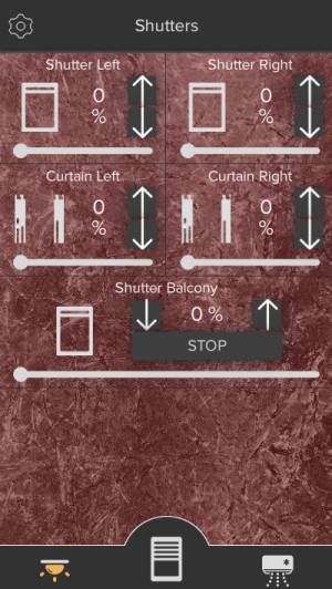
Roller shutter

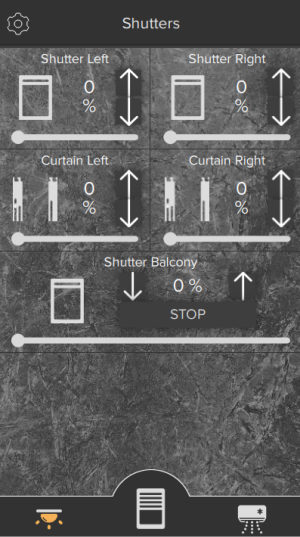
This object allows the user to control rollers.
- Visualization This property allows to visualize a preview of the object for each of possible status. (Open, close, or half).
- Graphic This property allows to select the icon correspondent to this object. If the ”Custom option” is selected, the ”Image for close”, ”Image for open” and ”Image for half” properties will be displayed:
- Image for close: Image displayed for ”Close” roller status.
- Image for open: Image displayed for ”Open” roller status.
- Image for half: Image displayed for ”Half” roller status.
Bus type Type of bus to communicate with the shutter. The default value is KNX, but other choices are available such as MyHome, Zwave, Lutron, DuoTecno.Movement Type Type of movement to control the shutter. Possible options:- Up/Down
- Left/Right
- Up/Down + Rotation
- Rotation
Absolute Positioning Enable/disable the absolute positioning of the roller shutter using the 1byte value group.Rotation Rotation range of the roller shutter, if applicable. Available options are 0-180 degrees, or 0-90 degrees.Inverted functioning If enabled, rollers will be activated inversely.
If ”Bus type” is set to ”KNX”, the following properties will appear:- Move group: KNX group that controls the rollers movement. If value 1 is sent, the roller is open, if value 0 is sent, the roller is closed.
- Stop group: KNX group that controls the rollers stopping. If value 1 is sent, the roller is stopped, if value 0 is sent, the roller starts to move again.
- Value group (only visible if Absolute Positioning is enabled): KNX group that controls the position of rollers; this value represents the opening percentage.
- Value feedback group (only visible if Absolute Positioning is enabled): KNX group that reads the value related to the position of rollers (1byte).
If ”Bus type” is set to Zwave, Lutron, MyHome or DuoTecno, it is enough to link the corresponding Gateway added in System, as well as the correct shutter element.It is highly recommended to correctly plug in the cables in the actuator in order to avoid the need to set the inverted functioning.
Analog value

This object allows to visualize a value read from KNX or from any other source in the GUI. The object permits also to set a value using a slider if this functionality is correctly set up.
- Visualization Four possible option are selectable (Numbers, straight icon, triangle icon or slider with +/- buttons).
- Send value If enabled, the analog value can be set and will be displayed on the client application. If “Send value” is enabled, also the property “Step for slider” will appear:
- Step for slider Indicates the numeric step needed to increment or decrement the value on the slider.
- Max value If the value is higher than the preset one, the latter will be always be displayed on client application. It is particularly useful for a better functioning of the graphical visualization.
- Min value If the value is lower than the preset one, the latter will be always be displayed on client application.
- Value Value preview on the GUI.
- Factor The read value will be converted according to this factor in order to be expressed with the desired measurement unit.
- Data source Source of displayed data (KNX, Modbus, System Object).
- Command Command to send when the value is changed by the user. Use percentual value inside the value that you want to replace with the slider value.
If the ”Data source” property is set to ”KNX”, the following properties will be displayed:- KNX data type: Type of KNX data to read from the bus.
- Value group: KNX group used to read the value.
- Value send group: KNX group used to send the value by pop-up.
If the ”Data source” property is set to ”Modbus”, the following properties will be displayed: - Modbus gateway: Modbus gateway previously configured in system objects.
- Value datapoint: Modbus datapoint used to read the value.
If the ”Data source” property is set to ”System Object”, the following properties will be displayed:
System status Status of a system object to use as data source.When the visualization type is set to “Slider”, the below additional parameters are visible:
- Show name label: allows to show the Label value on the object.
- Show value label: allows to show the datapoint value on the object.
- Colors of levels: allows to configure the different colors for each value interval.
- Show buttons +/-: displays or hides the slider buttons to increase or decrease the value.
- Button size defines the size of +/- buttons.
- Buttons background opacity sets background opacity for +/- buttons.
- Buttons background color sets background color for +/- buttons.
- buttons foreground color sets foreground color for +/- buttons.
- Grip color defines color for the slider grip.
Blinds
This object is now combined with the Roller Shutter in the Thinknx UP version.
This object allows the user to control blinds.
- Move group KNX group that controls the blinds movement. If value 1 is sent, the blind is open, if value 0 is sent, the blind is closed.
- Stop group KNX group that controls the blinds stopping. If value 1 is sent, the blind is stopped, if value 0 is sent, the blind starts to move again.
- Value group KNX group that controls the position of blinds; this value represents the opening percentage.
- Value feedback group KNX group that reads the value related to the position of blinds (1byte).
- Inverted functioning if enabled, blinds will be activated inversely.
It is highly recommended to correctly plug in the cables in the actuator in order to avoid the need to set the inverted functioning.
Scene

This object allows the user to launch, set or record a scene directly from the client interface.
- Scenary object Scene system object previously integrated into the system that will be associated to the current interface object. Please refer to the dedicated part in system objects_scene .
- Custom graphic If enabled, this property allows to user to select a customised icon, different from the default one.
Intercom

This object allows the user to answer the intercom from client application.
- KNX ring group KNX group that sends a telegram when an incoming call from an identified caller is detected.
- KNX close group KNX group that sends a telegram when a call received by client devices has to be stopped.
- Custom graphic If the ”Custom” option is selected, the ”Image file” property will be displayed:
- Image file: Customised image that will be displayed as object icon.
System PBX If disabled, the system works with an external PBX and the ”Caller ID” property will be displayed:- Caller ID: Doorstation extension needed to answer incoming calls; if no caller ID is inserted, the user will not be able to answer any call.
If the”PBX system” property is enabled, the ”PBX intercom device” property will be displayed: - PBX intercom device: PBX intercom device system object previously integrated into the system that will be associated to the current interface object.
If you do not know the Caller ID of the door station, you can retrieve it: leave the Called ID field blank, enter the data for registration and upload the project on iPad or iPhone. With the project open on the iOS client, close the app and make the call from the door station. The extension number of the door station will be displayed in the notification of the iOS client.
Chart

This object allows to display in the client interface the data stored in the Cloud database.
To work properly this object requires an active internet connection and the ThinKnx Cloud enabled and configured!
- Color theme Combinations of colors used to draw the chart.
- Show legend If enabled the legend of the chart will be shown.
If the Show legend property is enabled, the following two properties will be displayed: - Overlay legend If enabled, legend will be plot inside the chart area. If disabled, legend will be plot outside the chart. Only valid for iOS clients.
- Legend position Position of the legend in reference to the chart. Only valid for iOS clients.
- X axis List of X axis of the chart (only one available).
- Y axis List of Y axis of the chart.
- Series List of the series of data displayed in the chart.
- Navigation bar If enabled, the time interval can be selected. If the bar is disabled, the chart will show a fixed time interval regarding last data recorded.
If the Navigation bar property is disabled, the following property will be displayed: - Range viewer If enabled, a little point will be visualized under the main chart and will be used to navigate through data zooming and panning. Only valid for iOS clients.
- Timespan Timespan of data to show. It will start always with the present moment on the left.
Editing X axis
The chart supports only one X axis, to edit its properties click the button on the right of the X axis property:
- Label Name assigned to the X axis.
- Show label If enabled, the name of the axis will be displayed in the chart.
- Show grids If enabled, grid lines will be displayed for the axis.
Adding Y axis
By default, one Y axis is already created in the chart, but it is possible to add a second Y axis to differentiate the scales of the values displayed. To configure a Y axis, click on the button on the right of the Y axis property. In the widows that appears, click ”Add” to add a new axis and select it to edit its properties:
- Label Name assigned to the Y axis.
- Show label If enabled, the name of the axis will be displayed in the chart.
- Show grids If enabled, grid lines will be displayed for the axis.
- Axis position It allows to choose where the axis will be drawed, on the left or right of the plot.
- Custom range If enabled, the values range of the axis will be predefined. If disabled, it will be calculated automatically so that it comprehends the whole data range.
If the Custom range property is enabled, the following properties will be displayed:- Minimum Y: Value displayed in the lower edge of the Y axis.
- Maximum Y: Value displayed in the upper edge of the Y axis.
- Step: Value between two ticks on the Y axis
Adding a series
Each chart series represents a system Database variable. To add a series, click on the button on the right of the Series property. In the window that appears, click on ”Add” and adjust the properties of the new object:
- Label Name assigned to the series that will be displayed in the legend.
- Reference axis Y axis which the series refers to.
- Series type Type of graphical representation of the series in the plot (Point, Line or Column).
- Color Color of the line/point/column in the chart.
- Line width Line thickness of the line/point/column in the chart.
- Database Database system object which contains the variable to plot.
- Variable Database variable used to plot the data.
Weather

This object allows to add the weekly weather forecast to the project.
To work properly this object requires an active internet connection because the data are downloaded from an external server!
- City/Code The system will detect weather conditions of the selected city.
Web Browser

This object allows to add a web browser inside a project page, allowing the user to access web pages using one single application.
- URL URL that will be loaded in the browser, example: http://www.google.com.
- Show fullscreen if enabled, browser will show in fullscreen. The size will adapt to the screen's size and resolution.
Note that URLs with HTTPS used for secure communication are not yet available for the Web Browser object, and that there are some navigation limitations due to the inavailability of certain plugins.
Irrigation panel

This object is a dashboard used by the user in the client application to manage the Irrigation system object.
attention In order to work properly, this object need an internet connection, since data are downloaded from an external server.- Irrigation object Irrigation object defined in the system object, that will be associated to the current interface object.
Generic command
This generic button can be configured in order to perform a specific action (f.e: send telegrams on bus, launch a scene). It can be programmed to control each server service.
- Command Type of command to be related to this button.
- Font Three possible option are displayed:
- Graphic symbols: Mini-icons related to keyboard letters are added to the main object icon.
- Graphic symbols and text: Mini-icons related to keyboard letters, with their names displayed below, are added to the main object icon.
- Normal text: Customisable text can be added to the main object icon.
Text dimension Font dimension.Text colour Font colour.Extra text Customisable text.Custom graphic if enabled, the ”Image” property will be displayed:- Image: Customised image that will be displayed as object icon.
Extended command
This object is a particular button that, reading a value from KNX or a different data source, can switch between different states defined by the user. States can be represented by different images or strings. Depending on the data type of the source, strings for the states can also come directly from the source (for instance it is possible to show text coming from KNX or date and time). For each state it is possible to associate two actions, one for press and one for long press event. With this object it is possible to create very complex interaction elements like gauges, dynamic texts etc.
- Type Graphical type of the object:
- Graphic: Object’s states are represented by images.
- Text: Object’s states are represented by text defined by the user for each state or coming directly from KNX.
Use background If enabled a background colour is added to the object.KNX Data Type Type of data read from KNX bus.KNX group KNX group of the data to read.Feedback States List of object’s states defined by the user.Visualization This property allows to visualise a preview of the object for each of possible status.Adding states
To define Extended Command’s states, click on the button displayed on the right of ”Feedback States” property to open the states editor window, click on ”Add” and adjust the properties in the grid:
If ”KNX Data Type” property is set to DPT 10, 11 or 16, the following properties will be displayed:
- Display KNX String If enabled, the object will display the value read from KNX bus.
Otherwise the following properties will be displayed:
- Threshold The threshold is the string to compare to the string value read from KNX bus. It defines the feedback state.
- Criteria This property defines the comparison criteria used to check the string read from KNX.
- KNX string is equal to threshold: The comparison result is positive only if the value read from KNX is equal to threshold.
- Text: The comparison result is positive if the value read from KNX contains a substring equal to threshold.
If ”KNX Data Type” property is set to one of the remaining data types, the following property will be displayed:
- Threshold This property defines the minimum value assumed by the state. If the data type is 1 bit, the extended command must have two states, one with threshold 0 and one with threshold 1. If the data type is a 1 byte unsigned int (0 - 255), the values corresponding to extended command states will follow the table below:
States Threshold KNX value State 1 0 0-89 State 2 90 90-179 State 3 180 180-255 If ”Type” property is set to ”Text”, the following properties will be displayed:
- Text Text displayed when the condition defined in the ”Threshold” property is verified.
- Font size Size of the text defined in the ”Text” property.
- Text colour Colour of the text defined in the ”Text” property.
If ”Type” property is set to ”Graphic”, the following property will be displayed:
- Image file Path of the image file that will be displayed for the state.
If ”Use background” property is enabled, the following property will be displayed:
- Background color Background color of the object.
- Back. Transparency Transparency index of the background color, 0 means fully transparent, 100 fully coloured.
For each state it is possible to define two actions, one for press and one for long press:
- Command System command to perform when the object is pressed.
- Hold press function If enabled, the hold press function is activated for the object and the following property is displayed:
- Command hold: System command to perform when the object is long pressed.
Sensor

This object allows the user to visualise the status of an alarm sensor and provides the option to exclude it.
- Central Anti-theft device (”Alarm central” system object) previously integrated into the system that will be associated to the current interface object. Please refer to the dedicated part on System - Alarms .
- Sensor device ”Sensor” system object previously integrated into the system that will be associated to the current interface object.
- Exclusion This property allows the user to exclude the selected sensor.
- Sensor type Sensor type (movement detector, custom, door, window); each type has its own specific icon.
- Visualisation This property allows to visualise a preview of the object for each of possible status (steady or alarm).
Alarm keyboard
This object allows the user to enable/disable the alarm for all the partitions or just for some of them.
- Alarm central Anti-theft device (”Alarm central” system object) previously integrated into the system that will be associated to the current interface object.
- Hide sensor status This property allows to determine whether sensors status has to be displayed on the alarm keyboard.
Camera

This object allows the user to visualize the streaming of an IP camera in the application.
- Type If the desired type of camera is not included in the given list, the ”Generic camera” option has to be selected.
- Use RTSP If enabled, the system will interact with the selected camera using RTSP (rtsp://) streaming protocol; this option is used for H264 streaming. If a MJPG streaming is required, this property has to be disabled.
- Stream options Only visible if RTSP is enabled. Options to pass to the player to adapt to the characteristics of the camera. Options must be separated by “|”. Commonly used options are “rtsp-tcp” or “network-cache=500”.
When using RSTP, the Thinknx server tries to connect to the camera through UDP by default. In case the camera widget presents a delay before showing the stream, use the value “rstp-tcp” in the parameter “Stream Options”. Your camera might require a TCP connection in order for it to work.
In Stream Options, it is advised to use a small network cache setting such as 100 or 300 in order to avoid delays in connection
- Image path Image path needed to access specific snapshots of camera streaming.
- External address Camera external address without http://. It is the main IP address that the application uses to connect to the camera, unless “Use Local Connection” is enabled. In that case, priority is for the local IP address.
- External port Camera external port.
- Use local connection If enabled, this property allows the system to connect to the camera using the local LAN; if this type of connection fails, the system will automatically try to use the external network.
- Local address Camera local address
- Local Port Camera local port
If an external IP address is configured for the camera, it is advised in most cases to disable the use of the local connection, as it might create delays in a remote connection
- Username Login parameter.
- Password Login parameter.
- Image dimension Image dimension.
- Add timestamp A timestamp is a character added at the end of camera url that allows to stock the selected snapshot in a temporary iPad memory; it is particularly useful to prevent the camera from keeping to stream the same snapshot and to optimize the functioning.
- audio_stream_on Enable audio streaming
Useful Paths
- Hikvision
- MJPEG: ISAPI/Streaming/channels/101/picture (101 means 1 [channel 1] + 01 [main stream])
- MJPEG: ISAPI/Streaming/channels/101/picture?videoResolutionWidth=1920&videoResolutionHeight=1080
- RTSP (port 554): Streaming/Channels/101
- RTSP (port 554): Streaming/channels/101/picture
Grandstream- MJPEG snapshot/view0.jpg (or view4 for substream)
Provision- RTSP profile1 (or profile 2 to choose the second stream)
- MJPEG GetSnapshot
Geovision GV series- RTSP media/video1
- MJPEG images/snapshot.jpg
Audiofy
This object allows the user to control Thinknx Audiofy from inside the Thinknx application, instead of using the independent Audiofy application.
- Serial number serial number of the Audiofy to be controlled.
- Username username to authenticate with the Audiofy.
- Password password to authenticate with the Audiofy.
- Theme Audiofy's interface theme.
- Show fullscreen if enabled, Audiofy plugin will show in fullscreen. Otherwise, the integrator will need to configure the desired size from the Object Size parameter.
Page (Trend Line)

This object is the fundamental element for the User Interface. All the other objects forming the project are added on the page element. Each page can have a background color enabled, or a background image selected from the list available inside the software.
- Background visible Enable background option for the page.
- Background color Select the color for the background.
- Background image enabled Enable background image.
- Background image opacity Set the level of opacity for the background image (0 = fully transparent, 100 = fully opaque).
- Use custom background If disabled, the image is selected from the internal catalog, otherwise, a custom image can be imported.
- Background image selected Choose the background from an existing catalog, or select an imported image file.
- Background image fill mode Select the filling mode for the background. Options available: Pad, Preserve aspect and crop, Preserve aspect and fit, Stretch, Tile.
Switch (Trend Line)

This object is used for every kind of switching command: toggle, dimming, ”send 1”, ”send 0”, ”send 1 on press and 0 on release”, etc. If linked to a ”Switch schedule” object, this object can be used with a timer.
- Show label If enabled, the label is shown as text on the widget object.
- Show buttons as solid If enabled, the buttons will show with a background and a bever effect.
- Switching type This property indicates the way the command is sent; the following options will be displayed in the list:
- Dimmer: if this option is selected, a lighting percentage based on a value set by the user is sent to the system. (0 stands for ”turned off”, 255 stands for ”100% turned on”).
- OFF on pression: 0 is sent on pression, anything on release.
- OFF on pression, ON on release: 0 is sent on pression, 1 on release.
- ON on pression: 1 is sent on pression, anything on release.
- ON on pression, OFF on release: 1 is sent on pression, anything on release.
- ON/OFF norm. closed: 0 is sent for ON, 1 for OFF.
- ON/OFF norm. opened: 1 is sent for ON, 0 for OFF.
- Value on pression: a value predetermined by the user is sent on pression.
- Value on pression and on release: a value predetermined by the user is sent on pression and on release.
- Value on release: a value predetermined by the user is sent on release.
- Skip safety delay If enabled, the button will act immediately without waiting to detect the action of the user. The delay is needed to avoid unintentional button activation while scrolling pages.
- Bus type 11 different options are displayed (KNX, DuoTecno, Ethernet Gateway, Lutron, Modbus, MQTT, MyHome, Philio Gateway, Philips Hue, Zade, ZWave).
- Size Choose the size of the Switch widget (small, medium).
- Custom images This property allows to select an icon which will represent the object in its different states. By accessing the Collection window, it is possible to select icons from the Thinknx UP collection, or click on Custom Icon set to import other images.
- File for OFF: Icon displayed for ”Off” switch status.
- File for ON: Icon displayed for ”On” switch status.
- File for Dimmed: Icon displayed for ”Dimmed” switch status.
- File for OFF button: Icon displayed for the additional OFF button enabled (optional) in the “Show Buttons” parameter.
- File for ON button: Icon displayed for the additional ON button enabled (optional) in the “Show Buttons” parameter.
For every Graphic option selected it is possible to have a preview by editing the following property:
- Visualization This property allows to have a graphic preview of the object for each of its states (dimmed, on or off).
If the Switching type option is ”Value on pression”, ”Value on release” or ”Value on pression and on release”, the following properties are displayed:
- Value sent to the KNX group on press (1byte).
- Value sent to the KNX group on release (1byte).
For all switching types, a scheduling feature is available:
- Time schedule If enabled, the object can be linked to a Switch Schedule created in the System section, allowing the switch to be configured with a time schedule.
- Time Schedule Object: Select the Switch Schedule object created in System.
- Show buttons If enabled, additional buttons to send the ON/OFF command will appear (Left side: OFF button, Right side: ON button). The feedback will show in between.
- Text on buttons: If enabled, the additional buttons will show text instead of icons.
Show-Hide Buttons
- Active background Enables a background color to be shown when the button is in the active (ON) state.
Depending on the type of Bus selected in the parameter “Bus Type”, different parameters will be visible to configure the ON/OFF control and feedback of the object:For KNX:
- ON/OFF group KNX group which the value is sent to.
- ON/OFF group feedback KNX group that allows to read the value.
- Value group KNX group which the value set by the user that will is sent to; if the ”Dimmer” option is selected, the light will be regulated according to this value.
- Value feedback group KNX group that provides the feedback of the value set by the user.
For Modbus:
- Modbus gateway select the Modbus gateway created and configured in the System section.
- ON/OFF datapoint Modbus datapoint which the value is sent to.
- ON/OFF feedback datapoint Modbus datapoint that allows to read the value.
- Value set datapoint Modbus datapoint which the value set by the user that will is sent to; if the ”Dimmer” option is selected, the light will be regulated according to this value.
- Value feedback datapoint Value feedback datapoint.
For Lutron:
- Gateway Lutron Select the Lutron gateway created and configured in the System section.
- Lutron output Access the list of elements available for the current System object.
For Hue:
- Hue gateway Select the Hue gateway created and configured in the System section.
- Hue element Access the list of elements available for the current System object.
For MyHome:
- Gateway MyHome Select the MyHome gateway created and configured in the System section.
- Lights MyHome Access the list of elements available for the current System object.
For DuoTecno:
- Gateway DuoTecno Select the DuoTecno gateway created and configured in the System section.
- DuoTecno Light Access the list of elements available for the current System object.
For Ethernet Gateway:
- Ethernet Gateway Select the Ethernet gateway created and configured in the System section.
- Virtual Input Access the list of virtual inputs available for the current System object.
- Virtual Output Access the list of virtual outputs available for the current System object.
For MQTT:
- MQTT Gateway Select the MQTT gateway created and configured in the System section.
- MQTT Feedback (Subscriber) Access the list of MQTT subscribers available for the current System object.
- MQTT Command (Publisher) Access the list of MQTT publishers available for the current System object.
RGB Lamp (Trend Line)

This object allows the user to control an RGB lamp from the client application.
- Show label If enabled, the label is shown as text on the widget object.
- Show buttons as solid If enabled, the buttons will show with a background and a bever effect.
- Size Choose the size of the Switch widget (small, medium).
- RGB object Select the RGB object created and configured in the System section which will be associated to the current interface object. For more details refer to System objects - RGB.
- Supported mode Color mode used with the icon. The user can choose between “RGB” (color wheel only visible), “Tunable White” (no color wheel, just a spectrum to change the light's temperature), and “RGB + Tunable White” (possibility to toggle between color wheel and temperature spectrum).
- Visualization This property allows to visualise a preview of the object for each status. (ON or OFF)
- Custom images This property allows to select an icon which will represent the object in its different states. By accessing the Collection window, it is possible to select icons from the Thinknx UP collection, or click on Custom Icon set to import other images.
- OFF image: Icon displayed for the ”OFF” RGB status.
- ON image: Icon displayed for the ”ON” RGB status.
Thermo Comfort (Trend Line)
Comfort HVAC (Trend Line)
Roller Shutter (Trend Line)
Analog Value (Trend Line)
Scene (Trend Line)
Intercom (Trend Line)
Weather (Trend Line)
Generic Command (Trend Line)
Extended Command (Trend Line)
Camera (Trend Line)
- inter_objs.txt
- Last modified: 2024/04/11 10:48
- by wikiadmin
