Thinknx Configurator
- Main ConceptsToolbarSystem Integrator Account new!Interface Editor
Software Download
There are currently two versions of the Thinknx Configurator:
- Thinknx Classic version 1.2.25
- Thinknx UP version 1.3.0.8, which is an updated version of Classic with many additional features. To view the new features introduced with Thinknx UP, see this section.
Both versions can be downloaded from the Thinknx website at this link.
Main Concepts
Project Definition
A Thinknx project created inside the Configurator is defined as a folder containing all configuration files and settings related to a specific installation. All files imported into the project, such as ETS files, images, and other resources, are copied and stored inside the project folder.
A Thinknx project exported with the Classic Configurator version 1.2.25 has the .erg extension, while a project exported with the new UP Configurator version 1.3.0.8 has the .tup extension.User Interface
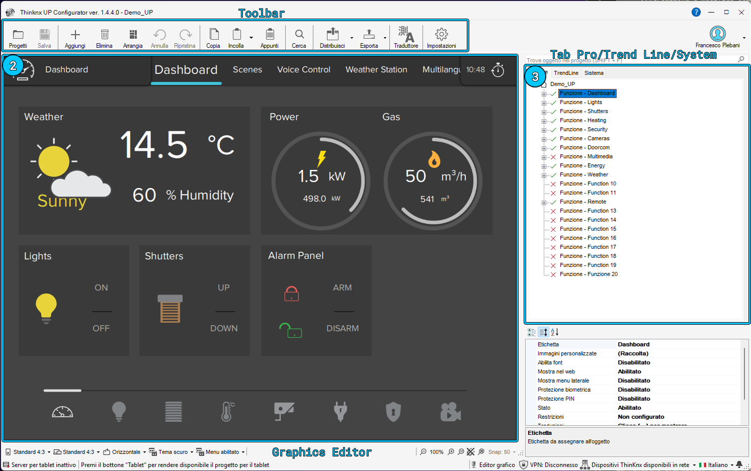
The main window of the Thinknx Configurator is composed of the following elements:
- a toolbar containing the main project management functions
- an interface editor, which is the workspace that reproduces the final graphical interface
- three tabs on the right called Pro Line, Trend Line and System Tabs, used to manage interface and system objects.
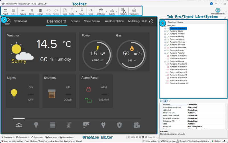
Thinknx Configurator interface
Clicking an interface object inside the graphical editor, or selecting it from the tree view, displays the list of properties related to that object on the right side, allowing the user to edit it. Multiple objects can be selected by clicking them while holding the SHIFT key. The first selected object is shown with a white border, while the following objects are surrounded by a blue border. In the UP version of the Configurator, the common properties of multiple selected objects can be edited at the same time. When arranging multiple selected objects, for example with the Align left command, the first selected object is always used as the reference.
Toolbar
The toolbar contains the main commands of the Thinknx Configurator. From this bar it is possible to manage projects, save changes, add or edit graphical objects, arrange page elements, search KNX groups, deploy the project and access support tools.

Thinknx Configurator toolbar
1. Projects and saving
This section of the toolbar provides access to project management and allows the current project to be saved.
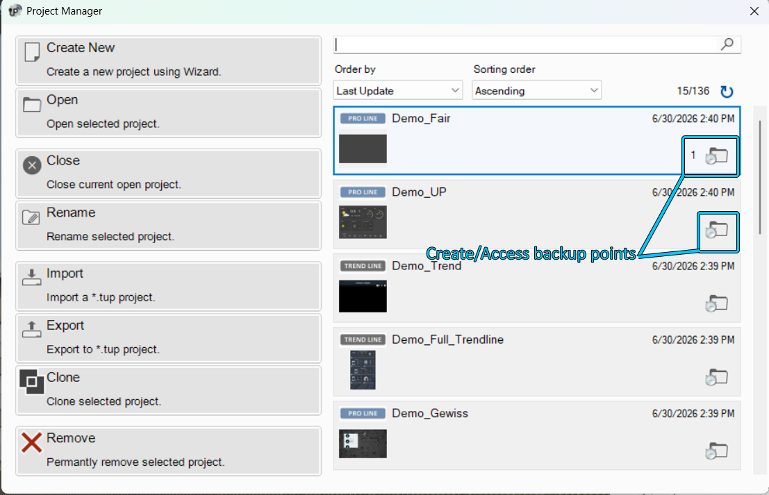
Projects opens the project manager window. From this window, the user can create, open, close, rename, import, export, clone or delete a project.
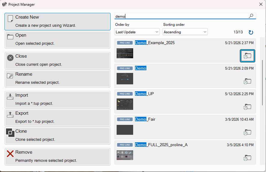
Several backup points can be created for the same project. This is useful when tests need to be performed without compromising the stable version of the project. Any version can be restored by clicking the folder icon next to the project and opening the Backup Points window.
For more details on how to create and deploy a Thinknx project, refer to this section.
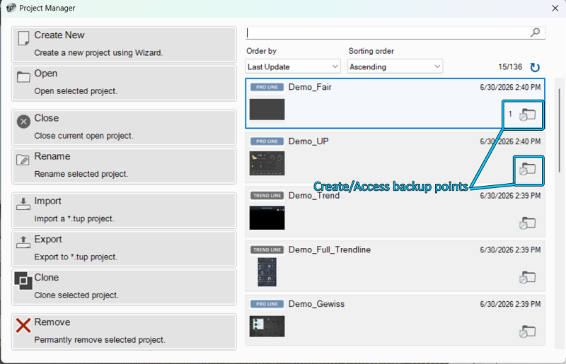
Project Manager window

Project Backup Points
Save saves the current project.
2. Creating and editing objects
This section contains the commands used to quickly add, remove or edit objects in the project.
Add allows new objects to be added to the project. The available object selection changes according to the tab selected in the right panel: Pro Line, Trend Line or System.
Delete removes the selected object.
Move activates the movement function for page elements. This function is available only in the Classic version of the Configurator. In the UP version, objects can be moved directly by dragging them.
Undo cancels the last operation performed.
Redo restores the last operation that was undone.
3. Arrange
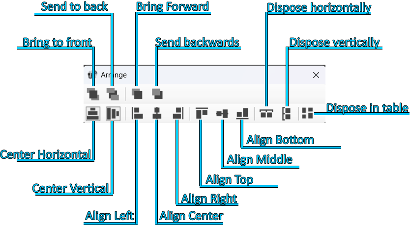
The Arrange tool allows the selected graphical objects to be organized. This function can be used to change the order of objects, align them, distribute them, center them on the page or automatically arrange them in a table/grid.
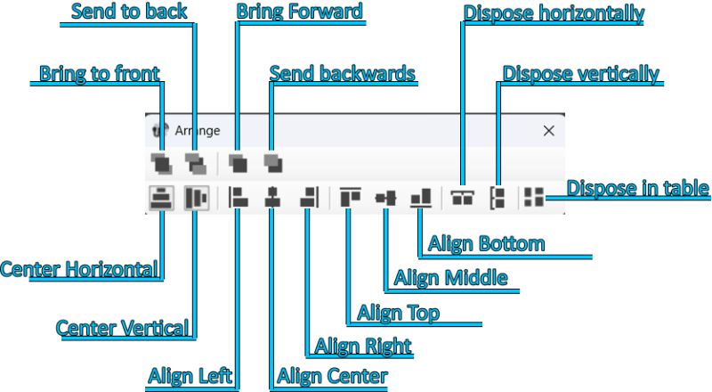
Arrange objects tool
Command Description Bring to front Moves an object or page in front of all other elements. Send to back Moves an object or page behind all other elements. Bring forward Moves an object forward in relation to the other elements. Send backward Moves an object backward in relation to the other elements. Distribute horizontally Evenly distributes the horizontal space between the first and last selected object. Distribute vertically Evenly distributes the vertical space between the first and last selected object. Align left Aligns all selected objects to the left edge of the reference object. Align center Aligns all selected objects to the vertical center line of the reference object. Align right Aligns all selected objects to the right edge of the reference object. Align top Aligns all selected objects to the top edge of the reference object. Align middle vertically Aligns all selected objects to the horizontal center line of the reference object. Align bottom Aligns all selected objects to the bottom edge of the reference object. Center horizontally Moves the selected object or group of objects to the horizontal center of the current page. Center vertically Moves the selected object or group of objects to the vertical center of the current page. Arrange in table Arranges the selected objects in a table/grid. Arrange in table
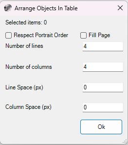
The Arrange in table tool allows the selected objects to be automatically arranged inside a table/grid. The user can define the number of rows, the number of columns, the spacing between rows and the spacing between columns.
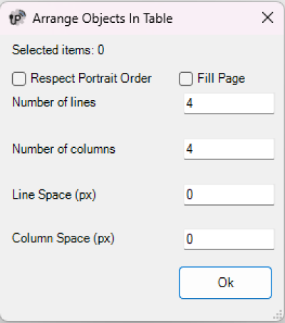
Arrange objects in table
The following parameters are available:
Parameter Description Selected elements Shows the number of currently selected objects. Respect Portrait order Keeps the selected objects arranged according to the Portrait order. Fill Page Automatically calculates the arrangement of the objects to fill the available page area. Layout suggestion / Process Calculates the suggested arrangement according to the selected options. When Fill Page is enabled, pressing Process automatically calculates the most suitable number of rows, number of columns and spacing values to fill the page. Number of rows Defines how many rows will be used to arrange the selected objects. Number of columns Defines how many columns will be used to arrange the selected objects. Row spacing (px) Defines the vertical spacing, in pixels, between rows. Column spacing (px) Defines the horizontal spacing, in pixels, between columns. If Fill Page is disabled, the user can manually define the number of rows, the number of columns, the spacing between rows and the spacing between columns.
If Fill Page is enabled, pressing Process automatically calculates the arrangement fields so that the selected objects are distributed to fill the available page area.
Some actions of the Arrange tool require multiple objects to be selected. To select more than one object, hold down the SHIFT key while clicking the elements to select.
When arranging multiple selected objects, the first selected object is used as the reference for alignment operations.
It is very important that background images, such as floor plans or photographs, are always placed on the backmost layer. They must always appear at the top of the interface tree view. This ensures that all command objects, such as light switches or shutter controls, remain in the foreground and are not covered by the image. If the image covers the button, the button will not be usable, even if the part of the image covering it is transparent.
4. Copy, Paste and Clipboard
This section contains the tools used to copy pages or objects and reuse them within the same project or in other projects.
Copy/Paste allows pages and objects to be copied or pasted. Elements can be selected either from the interface preview or from the interface tree structure. Once copied, they can be pasted into an empty area of the screen.
The keyboard shortcuts CTRL+C and CTRL+V can also be used, as well as the context menu opened with the right mouse button.
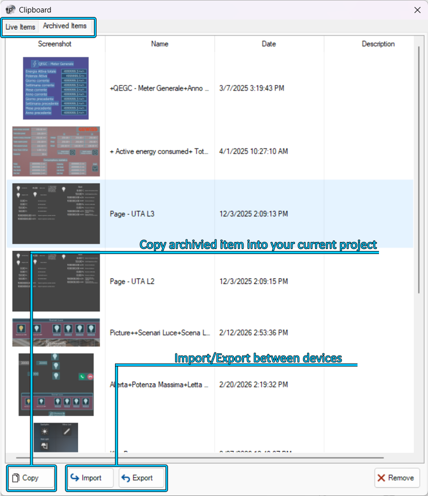
Clipboard shows the copied elements or pages. Copied elements are displayed in the Live Items section. By selecting a live element and clicking Send to Archive, the element is moved to the Archived Items section.
Archived elements can be reused even after closing the project, in another project or on another PC. The Clipboard is therefore useful for speeding up the design phase and reusing elements that have already been configured.

Clipboard
5. Search and replace
The Search tool allows KNX group addresses to be searched inside the project. The result shows the list of objects that contain the searched KNX group.
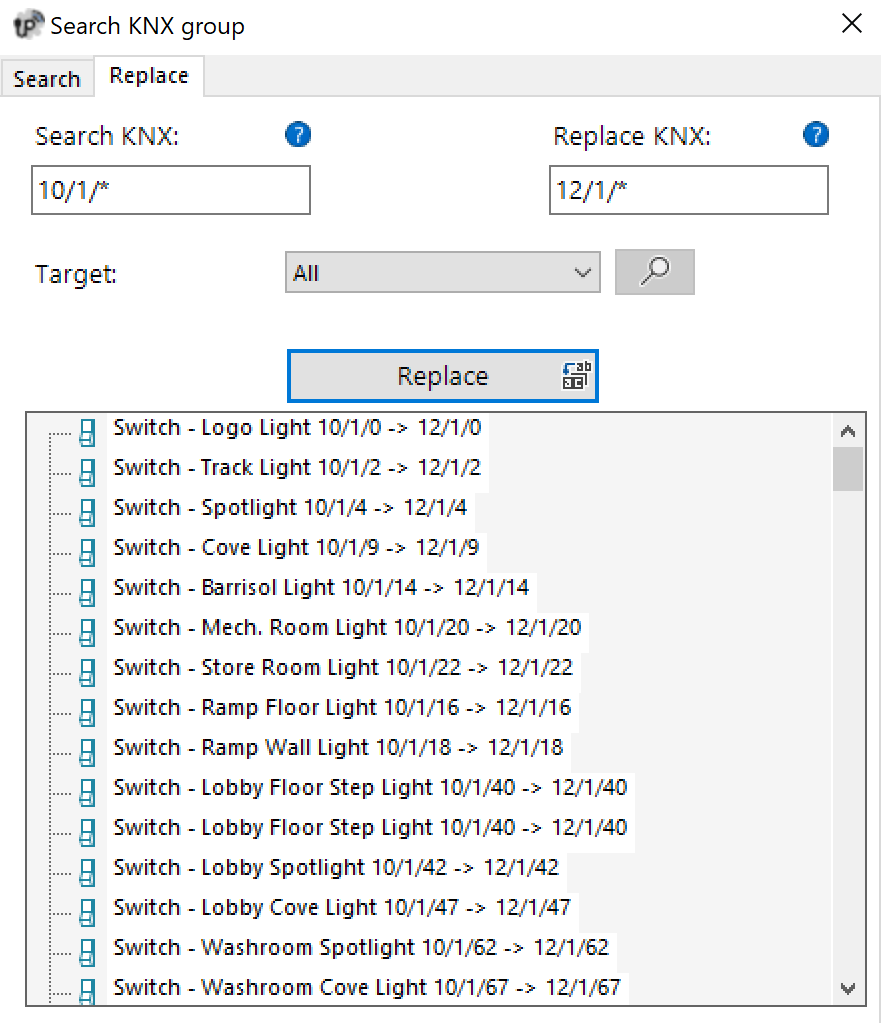
The Replace tab allows one or more group addresses, or part of a group address, to be searched and replaced. This function is useful when multiple objects that use the same KNX address structure need to be updated quickly.
For example, it is possible to search for all addresses starting with 0/0/ and replace them with a new address structure, while keeping the final part of the group unchanged when necessary.
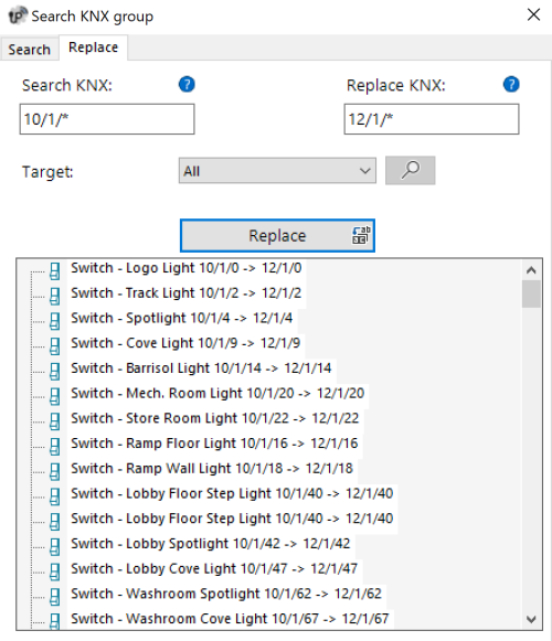
Search and Replace
Before confirming a replacement, carefully check the involved objects, especially when using partial searches or wildcard structures.
6. Deploy
The Deploy command allows the project to be deployed to the Thinknx server and client devices. Deployment can be performed via the local network or through Thinknx Cloud.
This function is used when the project must be sent to the real system so that it can be executed by the server and displayed by the clients.
7. Export
The Export command opens the project export menu.
Exporting allows the project file to be generated for backup, transfer or manual deployment purposes.
8. Logic module
The Logic Module command opens the section dedicated to project logic management.
From this section it is possible to configure the logic functions used by the system. It appears when at least one logic module is present.
9. Translator
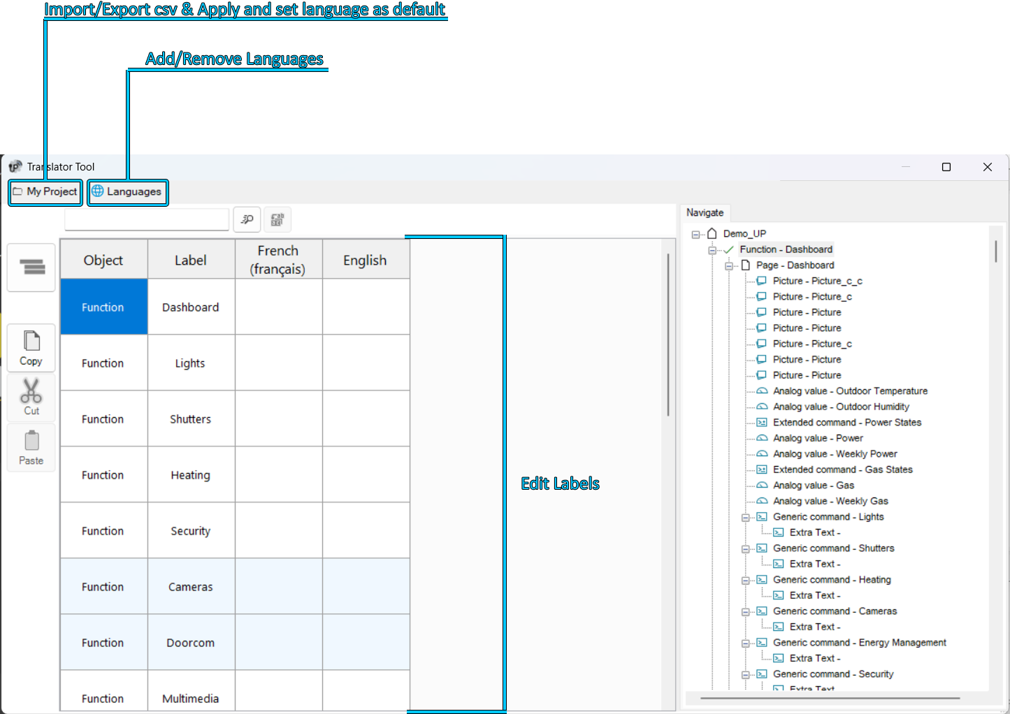
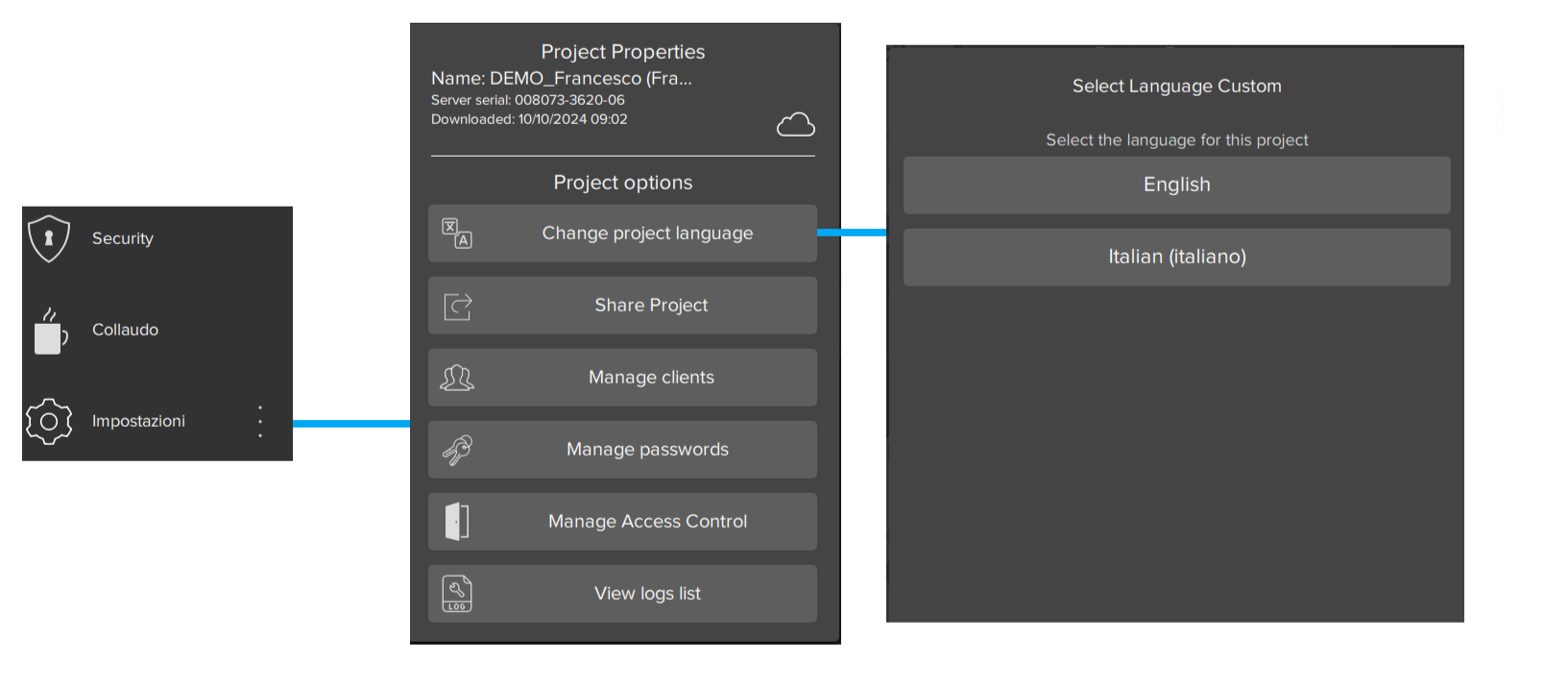
The Translator command opens the Translator tool. This tool allows the integrator to translate the Thinknx project into multiple languages.
End users can then change the language directly from the Thinknx UP application.
It is important to set one of the configured languages as default before deployment, so that users can select their language from the Thinknx UP application. To set a language as default, open the Languages menu and select Set Default.

Translator
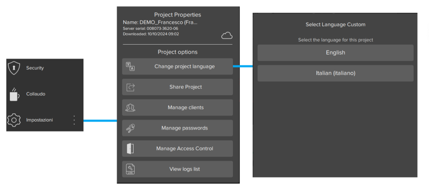
Select Language
10. Settings
The Settings command opens the general settings of the Thinknx Configurator.
From this section, it is possible to access the software's general options and modify the available parameters for configuring the working environment.
System Integrator Account
The Configurator allows login with a Thinknx portal account.
This function allows installers to use their portal account to access the cloud projects associated with the servers linked to their profile.
The Thinknx portal is available at the following address:
Through portal login, it is possible to:
- authenticate the user directly from the Configurator;
- view the cloud projects associated with the user's servers;
- download a cloud project into the Configurator;
- quickly open the portal dashboard;
- check project update status using the cloud icons in the project manager.
Login with portal account
The portal login button is available in the upper-right part of the Configurator.
Pressing the Login button opens the Thinknx portal authentication page. From this screen, the portal account credentials must be entered.
After completing login successfully, it is possible to return to the Configurator. The user is authenticated and the account name is visible in the upper-right part of the interface.

User menu
When the user is authenticated, pressing the account name displays a dedicated menu.
The menu provides access to portal-related functions.
The available entries are:
- Cloud projects
- Dashboard
- Logout
Cloud projects
The Cloud projects entry opens a window with the list of projects available in the cloud.
The displayed projects are those uploaded to the servers associated with the portal account used for login.

The window shows the main information related to the available projects:
Field Description Project Name Name of the project available in the cloud. Server Name Server associated with the project. Last Update Date and time of the last project update in the cloud. After selecting a project from the list, it can be downloaded using the Download Project button.
This function allows the installer to retrieve the available cloud version of a project associated with their servers.
Dashboard
The Dashboard entry opens the Thinknx portal directly in the browser.
The link opens the portal page:
From here, the functions available for the authenticated account can be accessed.
Logout
The Logout entry disconnects the portal account from the Configurator.
After logout, the functions linked to the portal account are no longer available until a new login is performed.
Cloud project status
When the Configurator is connected to a portal account, a cloud-shaped icon may be displayed in the project manager.
The icon indicates the update status of the local project compared to the version available on the cloud server.
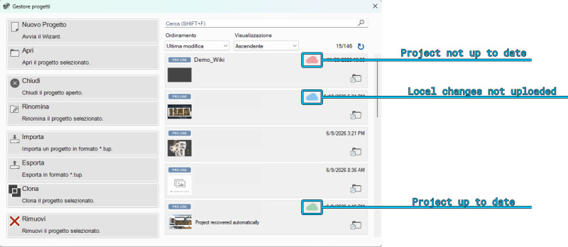
The available statuses are:
Icon Status Description Green cloud Project up to date The local project matches the version uploaded to the server. Blue cloud Local changes not uploaded The local project is aligned with the version on the server, but contains changes made in the Configurator that have not yet been uploaded to the cloud. Red cloud Project not up to date The local project is older than the version available on the server. Requirements
To use this function, the following requirements must be met:
- the Configurator must have Internet access;
- the user must log in with a valid Thinknx portal account;
- the portal account must be associated with the installer's servers;
- the projects must have been uploaded to the cloud.
Portal access therefore provides more direct control over managed projects, allowing the availability of cloud versions and the update status of local projects to be checked quickly.
Interface Editor
This is the workspace where users can build their graphical interface and see how it will appear on the clients. It allows them to add, select and move objects as needed. Each part of the interface has its own properties, which can be edited from the property editor on the right side of the Configurator window.

Main interface elements
The user interface is basically composed of the following elements:
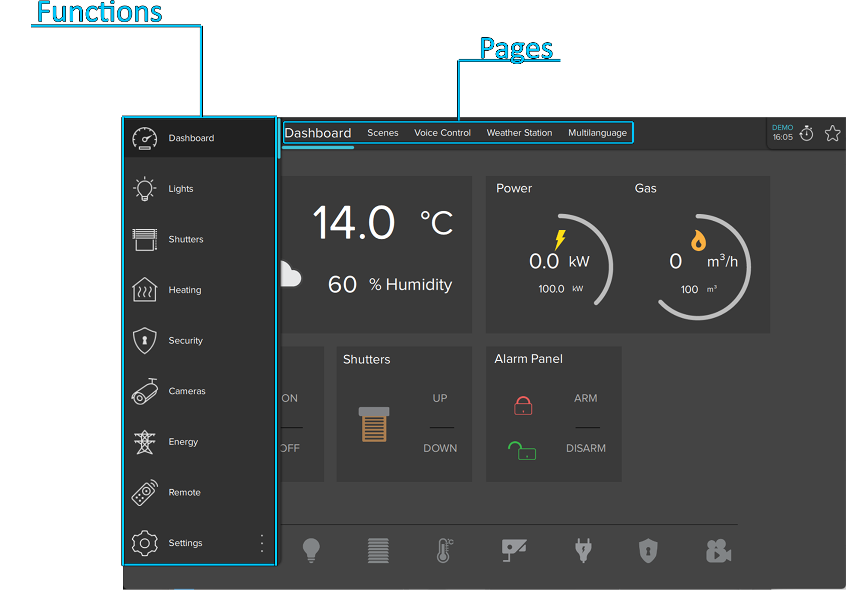
- Functions A function is a kind of chapter that can contain several graphical pages. Its properties can be easily edited from the settings window displayed on the right side when a function is selected from the list:
- Status: Allows the function to be disabled and hidden from the sidebar.
- Label: Name of the function.
- Icon/Graphic: Selects the desired icon file to be displayed on the left side of the function label, with a standard resolution of 60×60 pixels.
- Show on website: Indicates whether the function will be displayed on the web page. For more details, refer to this section.
- Restrictions: Allows access to the function to be limited for specific users.
- PIN protection: If enabled, the function is protected and the user must enter a PIN code to view it. For more details, refer to this section.
- PIN code: PIN code associated with the object.
- Index: The index of the function. It cannot be edited and is usually used to redirect a button to this function.
Function sidebar In the Classic Configurator, this bar appears by touching the blue tag on the left side of the screen or by dragging it to the right. In the UP Configurator, it is displayed by clicking the function name shown on the left side of the pages. It displays a list of all functions added to the project, with the function name and the corresponding icon.Pages Each function can contain several editable pages, each labeled by a tab displayed at the top of the screen. Each created page is automatically displayed on the top bar starting from the left. The only limitation on the number of pages that can be created is the number of characters that can be shown in the top bar. The longer the page names are, the fewer pages can be created. The properties can be easily edited from the settings window displayed on the right side when a page is selected from the list:- Label: Name of the page.
- Show on website: Indicates whether the page will be displayed on the web page. For more details, refer to this section.
- Restrictions: Allows access to the function to be limited for specific users.
- PIN protection: If enabled, the page is protected and the user must enter a PIN code to view it. For more details, refer to this section.
- PIN code: PIN code associated with the object.
- Index: The index of the page. It cannot be edited and is usually used to redirect a button to this page.
Objects Each page can contain several editable objects. There are many graphical objects that represent standard operations, such as switching lights on or off, controlling shutters or managing HVAC. Each object has its own properties that can be customized. For more details, refer to Interface objects.Object Selection
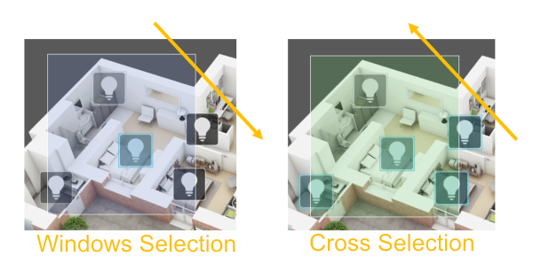
After objects have been added to the interface, they can be easily selected and moved with the mouse cursor. Clicking and dragging from left to right selects all objects completely enclosed by the selection border. This is called Window Selection. Clicking and dragging from right to left selects any object crossed by the selection border. This is called Crossing Selection.

Selection tool
Pro Line, Trend Line and System Tabs
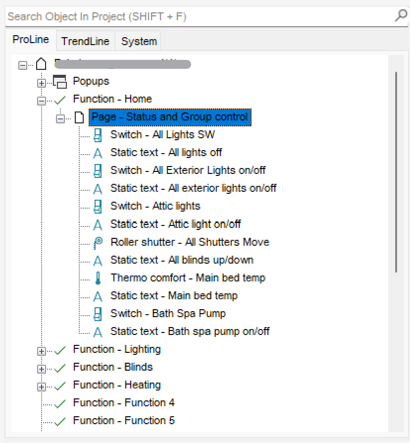
- Pro Line tab: Clicking the Pro Line tab displays all user interface objects added to the current project and supported by the Pro Line application (Thinknx UP). The main node represents the entire user interface, while each first-level child represents a function. Under each function are the added pages, and under each page are the objects related to it. By right-clicking each node, the user can add, delete, copy or arrange any interface object. For more details, refer to Interface objects. Selecting an object from the interface editor or from the interface tab displays all related properties in the property grid below the tabs.
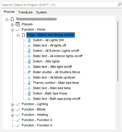
Pro Line tab
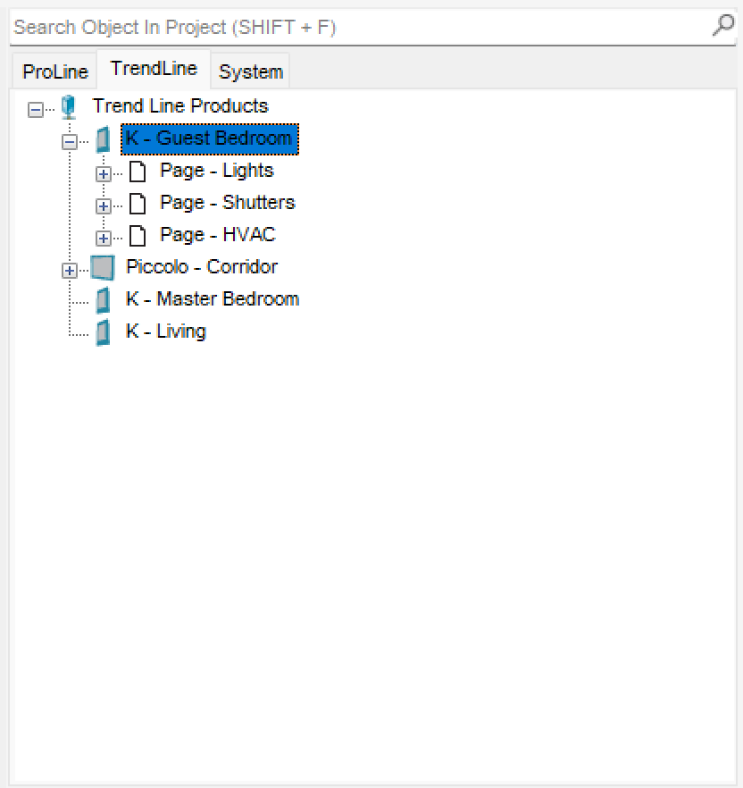
- Trend Line tab: Clicking the Trend Line tab displays all Trend Line devices added to the project and allows them to be configured. A new Trend Line device can also be added from this tab by right-clicking the title and selecting “add device”. Once the device has been added, right-clicking it allows objects such as pages and page elements to be added to the device.
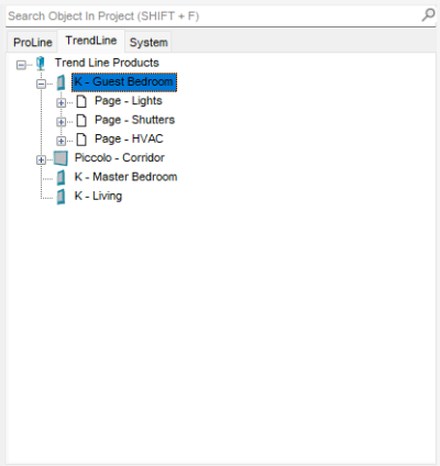
Trend Line tab
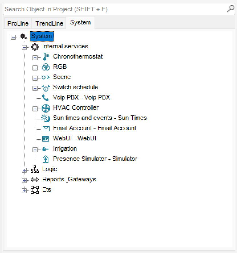
- System tab: Clicking the System tab displays all system objects added to the current project. The main node represents all general and most important data related to the server and the project. By right-clicking the System tab, the user can add any system object. Clicking an existing system object displays all related properties in the property grid below the tabs. For more details, refer to System objects.
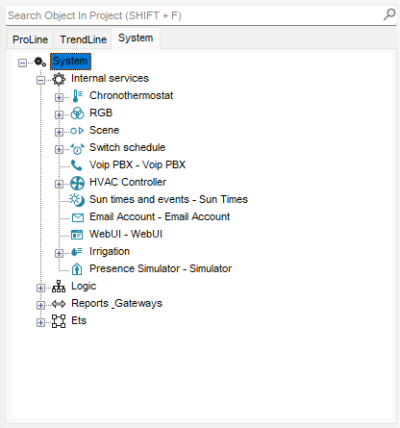
System tab
System Configuration
Licenses
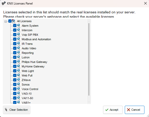
The license editor displays the list of available licenses that can be purchased and selected by the customer. It is possible to select bundles or individual licenses by checking the box next to each item. Clicking any license displays a short explanation of the selected item on the right side of the window.
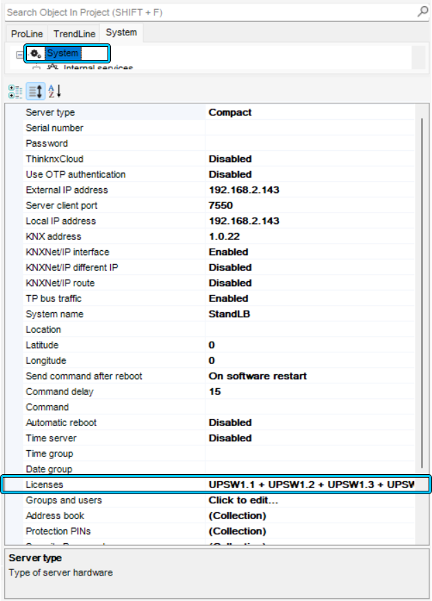
To access the license editor, click the System tab and select Licenses from the property window. The license editor also appears when a new project is created inside the wizard. For more details, refer to this section.

Accessing the license editor
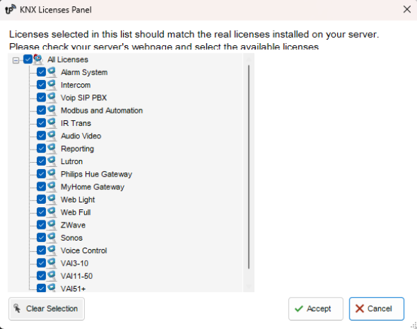
License editor
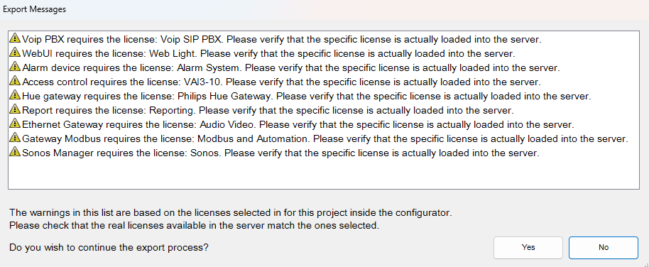
With UP Configurator version 1.3.0.16, standard licenses are automatically selected according to the server model configured in the System tab. Any additional license added to the server must be manually selected in the optional licenses section.
When using older versions of the UP Configurator, version 1.3.0.15 or earlier, it is strongly recommended to set the licenses in the Configurator according to the licenses actually available on the server. This ensures that a project exported without warnings from the Configurator works immediately on the server.
Example: Assume that, for a particular server, the enabled licenses are: Security and Intercom package, Audio/Video license and Web license with 4 clients. These licenses must be selected in the license editor and the number of clients must be typed in the upper-right box.If an IR transmitter object is added to the project, a window with the following warning is displayed:
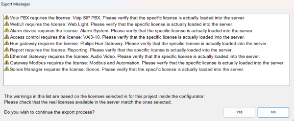
Warning: device not supported by the selected licenses
This warning indicates that the object in question will not work once the system is activated, but it does not block project export.
Users and Groups
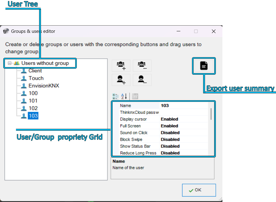
Users and groups allow different interface settings and profiles to be generated within the same project. To create, edit or delete users or groups, select the “System” object and then click the “Users and Groups” property. Click the button on the right to access the editor.
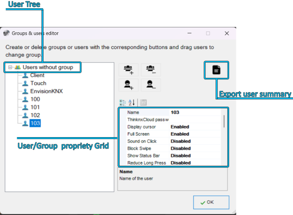
Users and groups editor
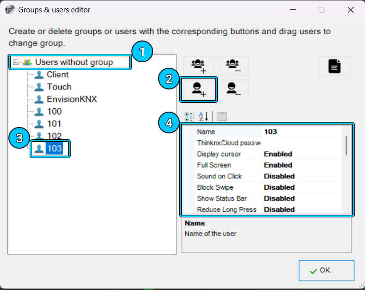
To create a new group, click the “New group” button. A new element with a default name is displayed in the user tree. To edit the name, click the element and adjust the properties in the grid on the right.
Adjusting the properties of a group applies the changes to all users inside that specific group.- Name Name of the group or user.
- ThinknxCloud Password Visible only for the user. This is the individual password associated with this user in the ThinknxCloud service. Two users cannot have the same password.
- Show cursor If disabled, the cursor will not be displayed. Valid only for Windows/MacOS clients.
- Full screen If enabled, the application will be displayed in full screen mode. Valid only for Windows/MacOS clients.
- Click sound If enabled, a beep is emitted at each mouse click.
- Lock swipe Determines whether touch devices support advanced gestures. Not valid for iOS clients.
- Show status bar Determines whether a status bar is displayed in client applications. Only for iOS clients.
- Reduce long press If disabled, the user can interact with the client using the default long-press time, for example 4 seconds for iPad and 3 seconds for Android. If enabled, the long-press activation time is reduced to 1.5 seconds.
- SIP client Determines whether the VoIP function is enabled. If enabled, the following properties are displayed:
- SIP ringtone Allows the ringtone played on the client device when it is called by another SIP device to be set.
- Use random client port If enabled, a random listening port is used on clients to avoid possible conflicts between VoIP applications.
- SIP protocol Determines the protocol to use for sending SIP messages. The TCP protocol is mandatory for iOS devices to work in background mode. The UDP protocol is mandatory for some PBX servers.
- Register Determines whether the client will register to a SIP registrar (PBX). If enabled, the following properties are displayed:
- PBX system: If enabled, the internal ThinKnx PBX is used and the client will be one of the PBX users created on the PBX system object. Refer to this section. If disabled, the client will attempt to register to a third-party PBX and the following properties are displayed:
- SIP username: SIP client username used during the registration process.
- SIP password: SIP client password used during the registration process.
- Registrar address: IP address or hostname of the third-party registrar (PBX).
- Registrar port: UDP port number of the third-party registrar (PBX).
Inactivity timer If enabled, this property allows a specific page to be configured so that it is automatically reloaded by the client after a predefined time interval if the user does not interact with the client. The properties “Inactivity interval”, “Inactivity function” and “Inactivity page” are displayed.Inactivity interval User inactivity time interval after which the system automatically redirects to the selected page. If the user touches the screen, the inactivity timer is automatically reset.Inactivity function Index of the function to which the default page belongs. Starting from 0.Inactivity page Index of the default page. Starting from 0.Show scheduler If enabled, an icon is displayed in the client application to open the Scheduler Manager in the upper-right corner of the interface. If disabled, the icon is not shown and the client does not have access to the scheduler.Scheduler PIN protection If enabled, new properties are displayed to add the PIN to the scheduler.Use Navigation Bar If enabled, a Home or Back button is added to the upper-right part of the client to return to the main page or to the previous page.Use Favorites If enabled, a star-shaped button is added to the upper-right part of the client. The end user can create a custom page and add any object present in the application to create a personalized page.Record client-specific functions If enabled, client-specific commands, such as page changes, are included during scenario recording.Access wallet If enabled, the user can access expense report information.Log access If enabled, the user can access the access log.Enable access control If enabled, the user can manage access control.Reset PIN If enabled, the user can reset PIN codes from PIN keypads.To create a user already associated with an existing group, select the target group and click the “New user” button. In this way, the user inherits the property values from the group. To rename the user, select it from the user tree and adjust the “Name” property in the grid on the right.
To create an independent user, click the “New user” button without selecting any group.
Users can be associated with a group later by dragging them onto the desired group.
To delete a group or user, click the “Delete object” button after selecting it. The Configurator asks for deletion confirmation; click “Yes” if the item must be deleted.
When a group is deleted, all associated users automatically become independent users. If some objects integrated in the installation contain restrictions for the specific group or user being deleted, a warning message is displayed with the list of objects containing a restriction. If deletion is confirmed, the restrictions for the group or user are also removed.
Adding a new user to a group
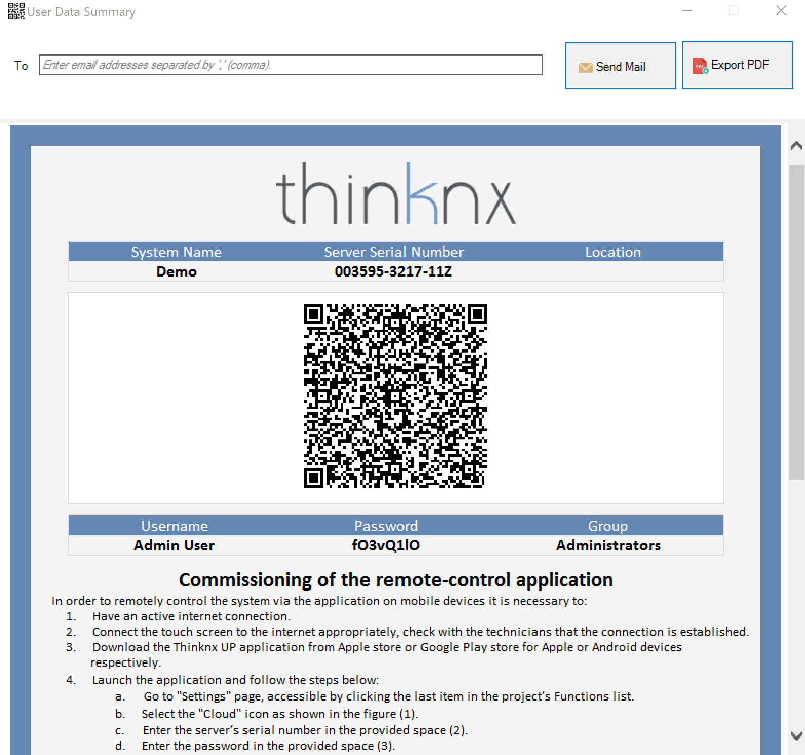
To export user information or share it by email or QR code, click the User Data Summary button. A new window opens, allowing the email addresses with which to share the information to be entered, or the file to be exported as a PDF by clicking the Export PDF button. A QR code is also available and can be scanned directly from the Thinknx application to automatically download the project with the correct user profile.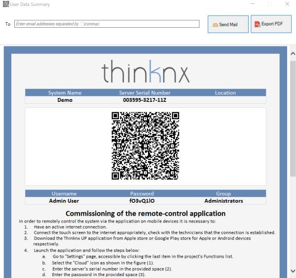
View and export user information
Restrictions
Sometimes a group of users must be prevented from viewing and accessing certain functions, pages or elements inside a page. This can be done by first creating the users in the System tab, then going to the function in the interface tree, selecting the “Restrictions” property in the grid and clicking the button on the right.
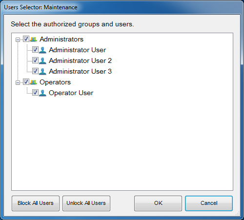
Restriction editor for functions/pages/objects
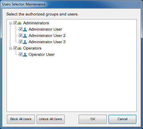
The restriction editor displays all previously created users and groups. By default, all objects have no restrictions. For this reason, when the editor is opened for the first time, all elements are selected to allow users to access the selected object.
Assume that all users belonging to the “Operators” group must be blocked. To create this restriction, simply deselect the checkbox next to the group name and click “OK”. When the project is exported to users under Operators, the selected function will not be visible to them.
Two additional buttons, useful for speeding up the configuration process, are available in the editor: “Block all users”, which applies a total restriction to the object by removing all checkmarks, and “Unblock all users”, which removes any previously set restriction from the object.
All restrictions have a priority order: function, page, single object. If a restriction for a user group is set on a function, the entire function will not be exported, even if the same restriction is not set for the objects contained in that function.
PIN Protection
If all objects inside the project must be visible to all users, but some of them still require protection, PIN protection can be used on the desired object.
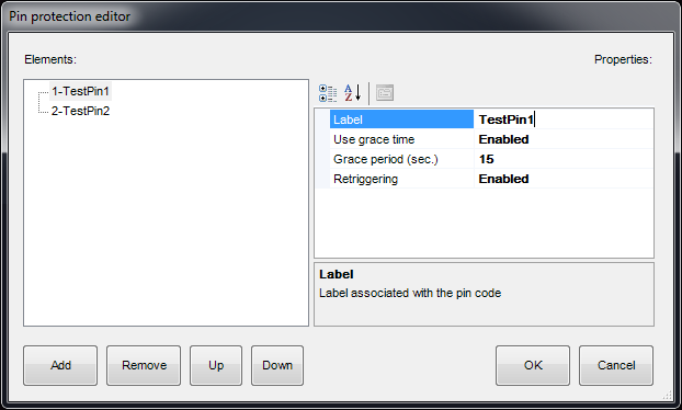
Inside the project, a list of PIN codes can be created and used in the client application to protect interface objects. To create, edit or delete PIN codes, select the “System” object and then click the “PIN protection” property displayed in the lower grid; then click the button on the right to access the editor.
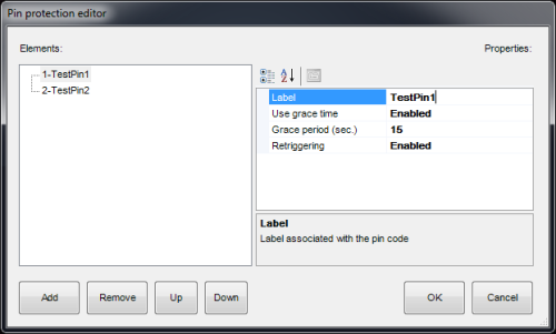
PIN protection editor
To create a new PIN, click the “Add” button. A new item with a default name is displayed in the list. To edit the name, click the item and adjust the properties in the list on the right.
- Label Name of the PIN code.
- Use grace time If enabled, the entered code remains valid for the period set in the “Grace period” property and the client will not request the code until the grace period expires.
- Grace period (sec.) Period, in seconds, during which the entered code is valid.
- Renewal If enabled, every time the user touches the object while the grace period is valid, the grace time is renewed.
To associate PIN codes with functions, pages or interface objects, select the desired object in the interface tree, select the “PIN protection” property in the grid and enable it. The “PIN code” property is displayed, together with the list of PINs previously created in the System node.
The default PIN code value is 12345
A PIN code can be associated with several objects, but an object can contain only one PIN code.
PIN protection applies only to user-driven actions; actions such as automatic page changes are not subject to PIN protection.
The user can change the PIN code directly from the client app. To reset all PINs to their default values, connect to the server web page and press the “Reset all PINs” button inside the “Server→Users” page.
When “PIN protection” is set to “Enabled” and the “Switching type” property of the switch object has one of the following values, the grace time must be enabled and set.
- OFF on press
- OFF on press, ON on release
- ON on press
- ON on press, OFF on release
- Value on press
- Value on press and release
In the client application, when the object is pressed for the first time, the keypad appears. Once the code has been entered, the switch is unlocked. To perform the desired action, the user must press the switch a second time after the unlocking procedure. The switch remains unlocked within the “Grace period”. After the “Grace period” expires, the switch is locked again and the “PIN code” is requested once more.
Security Password
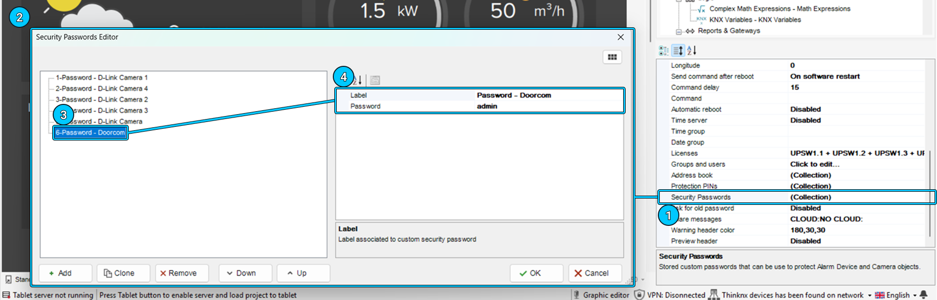
Security passwords are passwords stored inside the server and used for cameras. The system integrator can configure any security password, which the user, if provided with administrator privileges, can later modify in order to maintain a high level of security.
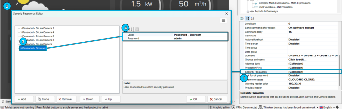
Security Password
Biometric Protection
Another way to protect elements inside the project is through the Biometric Protection parameter. When enabled, the object remains visible in the application, but facial recognition or fingerprint verification is required before the user can activate the command.
KNX Groups
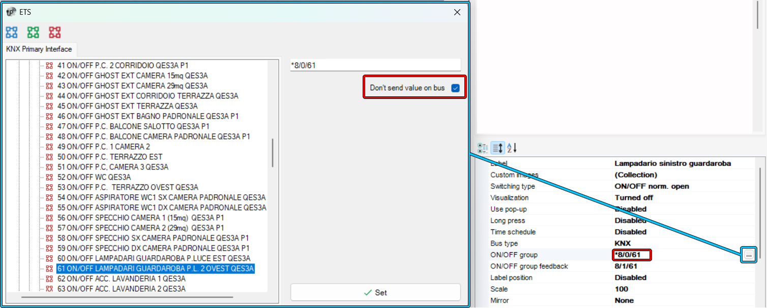
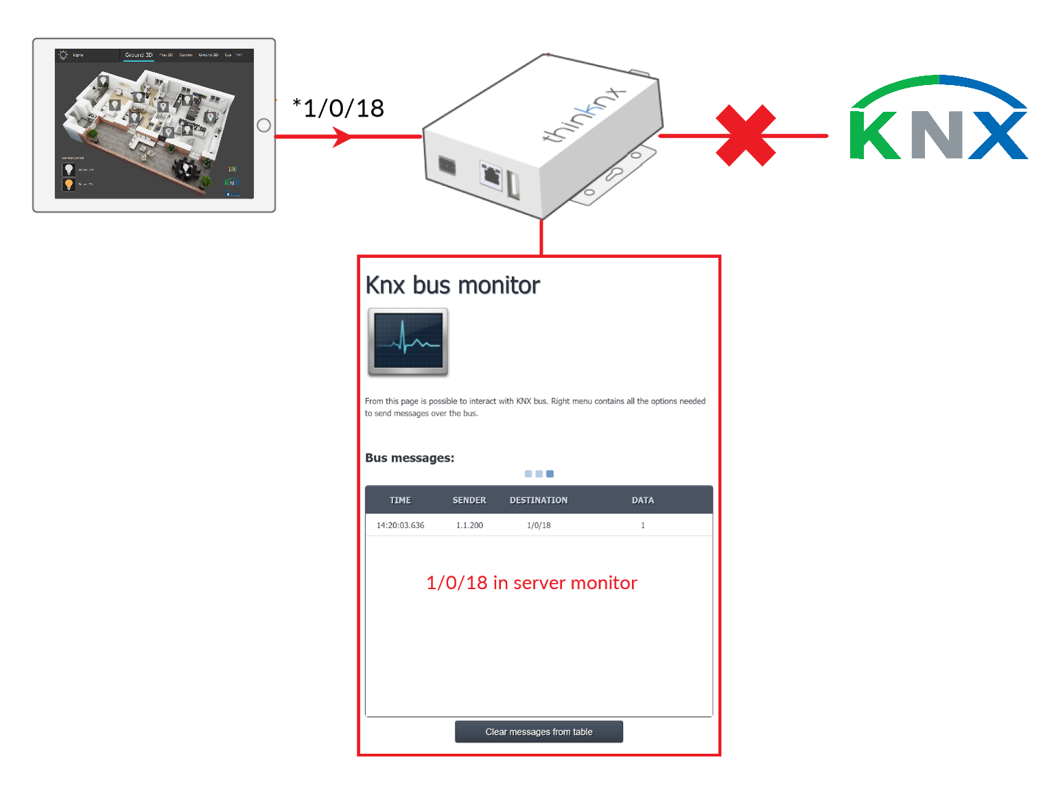
Inside the Thinknx system, KNX groups can be divided into two main categories: read groups and write groups.\ Read groups can contain multiple KNX addresses: the addresses must be separated by “;”. The object status takes the value passed by the last telegram received from one of the addresses in the group.\ Write groups contain only one address. For each address of the write group, sending on the KNX bus can be disabled by selecting the option in the ETS window or by entering an asterisk before the group address. This allows the user to run a simulation mode in which the status of this group can be changed without generating traffic on the KNX bus. The group will be visible only in the KNX monitor of the Thinknx server.

Disable sending on the bus
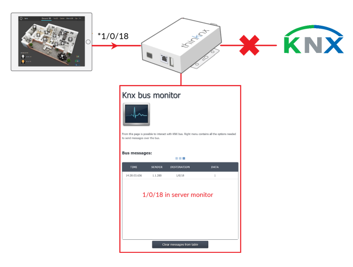
Disable sending on the bus
- main_cons_ui.txt
- Last modified: 2026/07/01 12:06
- by francesco